 Spend
Spend 


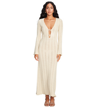
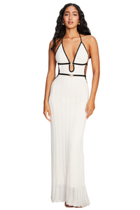


Prints can instantly give an outfit more personality, but styling them doesn’t mean every piece has to compete for attention. One of the easiest ways to make a printed piece feel intentional is to balance it with solid colors and simpler silhouettes.
The right combination creates contrast without making the outfit feel overwhelming. It’s less about following strict rules and more about knowing when to let one element lead.
Let the print set the tone
A striped piece can be an easy starting point because the pattern already brings structure to the look.
The Alicia Stripes Top adds visual interest while keeping the overall look fresh. Instead of pairing it with another bold print, let the stripes take the lead and build the rest of the outfit around them.

Try it with solid-colored bottoms and understated accessories for a clean daytime look. The simpler the supporting pieces, the more naturally the print stands out.
Black and white: the easiest contrast
Not all prints need color to make an impact. A black-and-white pattern can create a strong visual effect while remaining surprisingly easy to style.
The Nara Steel Black & White Skirt works as a statement piece without requiring much else. Pair it with a simple top in one of the colors already present in the print to create a cohesive look.

For a more relaxed approach, keep the accessories minimal. For something more polished, add structured accessories or a more refined shoe.
The key is to repeat one element of the print rather than introducing another competing color.
Add color without overwhelming the look
Once you feel comfortable balancing prints with neutrals, you can introduce a stronger color into the combination.
The Nuri Pink Short brings a playful dose of color that can work as the solid element in a more expressive outfit. Pairing a bright solid with a subtle print creates contrast while keeping the look visually balanced.

If you're combining two noticeable elements, keep everything else simple. Neutral accessories and clean silhouettes can give the outfit enough space to breathe.
The balance is in the details
Mixing prints and solids doesn’t require a complicated formula. Start by choosing which piece you want to stand out, then use the rest of the outfit to support it.
If the print is bold, keep the surrounding colors simple. If the pattern is subtle, you can introduce a stronger solid color. And if you’re working with two statement elements, make sure they share something in common, whether it’s a color, tone, or overall mood.
The goal isn’t to make every piece match perfectly. It’s to create enough contrast to make the outfit interesting while keeping the overall look intentional.
Break the rules, but keep the balance
Personal style is about experimenting, and mixing prints with solids is one of the easiest ways to do it.
Start with one printed piece you love, add a solid color that complements it, and keep the rest of the look simple. Once you find combinations that feel natural, you can start playing with stronger contrasts and unexpected pairings.
Because sometimes the best outfits aren’t the ones where everything matches. They’re the ones where every piece has a reason to be there.